CCSF Web Design
User Interface, User Experience
To design a website for high school students pursuing a degree in the Culinary Arts at City College of San Francisco. The challenge of this project was to design the front page of the website so that recent high school students can easily navigate content and information.
ROLe: UX Designer and Researcher
Process and Research

Problem
Users found that...
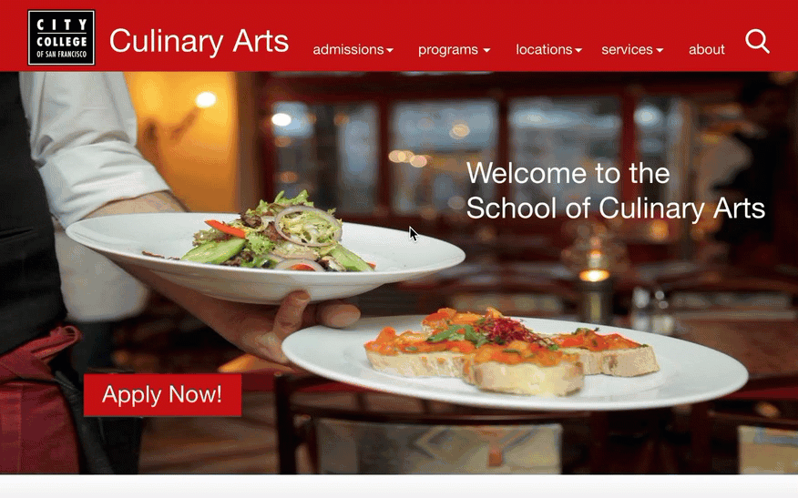
The Culinary Arts program webpage is outdated and old
The content is overwhelming as too much text is on one page
Too many tabs that are not focused and catered towards Culinary Arts,
Website includes unnecessary information on other majors
Design patterns were not prominent
Users wanted to have information about courses, but not in wordy paragraph
Users needed simplified tabs to find information
Wanted a way to connect with school
Colors were distracting
Information was scattered all around the page with no reference point
Alignment issues
Ideation & Brainstorm
In the ideation phase I ideated different ideas and ways in which I can organize information to allows my users to find information with ease. Some of the ideas I implemented were vertical drop down menu to organize information as well as visible and prominent call to action button that allow users to find information. A search icon was added to allow flexibility for users to find information quickly.
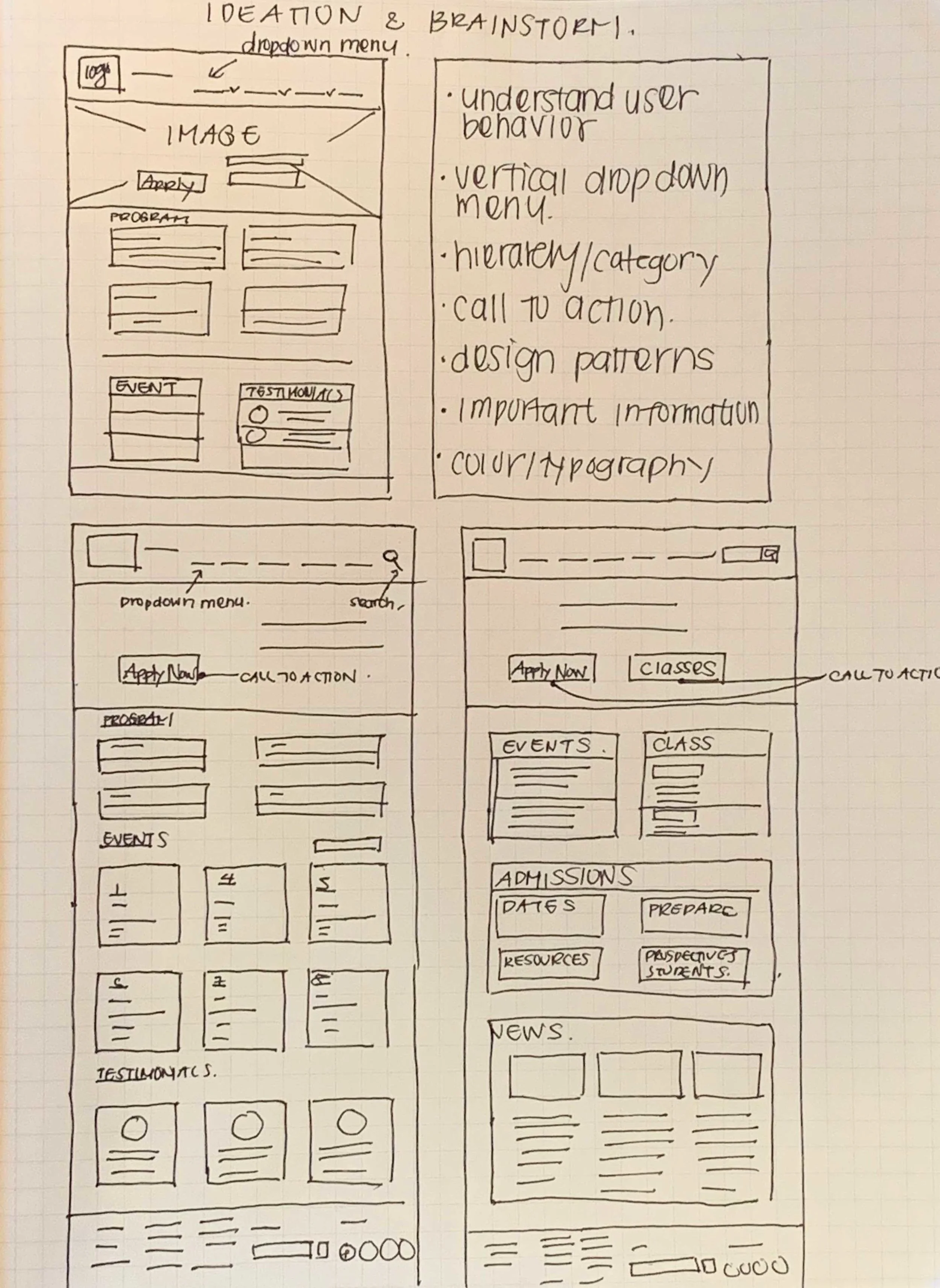
Wireframe

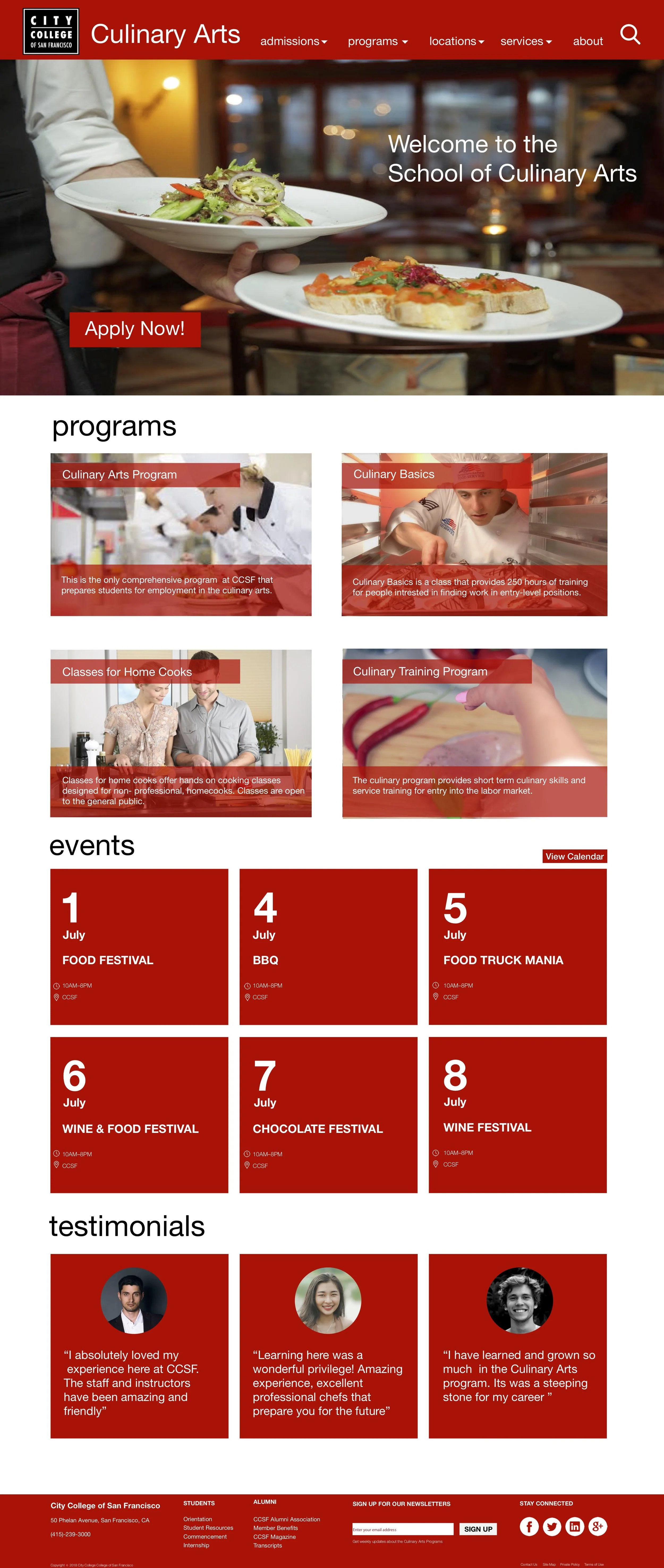
Solution
“The design is intended to be clean and minimal which allows users to efficiently find information”
Key Features...
Include simplified drop menus to make the navigation bar clean, visible, and intuitive.
The search icon can be clicked to find information more efficiently and effectively.
A call to action button was added to make enrolling and applying to college easier in the new design . In the old design there was no way of knowing where to apply for college, and the button was not prominent.
Program with titles and short concise description of the program that allow users to grasp information quickly.
Photos from PEXEL were used to associate different program so users can easily find program that fits their needs as well as make the front page look more institutional and educational.
Event and condensed calendar allows students and prospective students to attend culinary events. Testimonials to engage prospective students with program and also serve as marketing tool.
Footer is redesigned to allow users to find more about school information by clicking on tabs.
Email form added to allow prospective students to get updates about programs and events.
Social media icons were added to allow users to follow accounts to get latest news and allows user to engagement with college
Web Page Redesigned

Reflection
After redesigning the home webpage, users found that call to action buttons were more prominent. Information and visual hiereachy of information was fixed and allowed users to easily navigate through information with ease.
After working on this project I want to stress how important it is to understand users need. What I learned through this challenge was that I need to dive deep in research and find out what my users pain points For example, I need to have qualitative user research in order to get data that will be useful in order to develop a product that fulfills their needs. I also realized that I need to understand areas where my users face problems or have behavioral and emotional changes. Through research, personas, ideations, and prototyping, I've gained a better understanding of user research. If given more time I would conduct more user research and prototyped more ideas and reiterate my designs. I learned that user research is an on going process and that every design will be different from the next, and that each situation needs to be tailored differently