Travelocity UI Redesign
Role:UI Designer
Problem: Travelocity is an online travel agency platform that allows its user to book flight and make travel arrangements. One of the main problems with the mobile user interface design is that it does not have recognizable user design patterns that allow users to easily navigate through content and information. To find a better solution, I made the process of booking a flight simple by reducing steps to simplify the process while also implementing intuitive design patterns so users can have a easy and seamless experience in booking their travel plans.

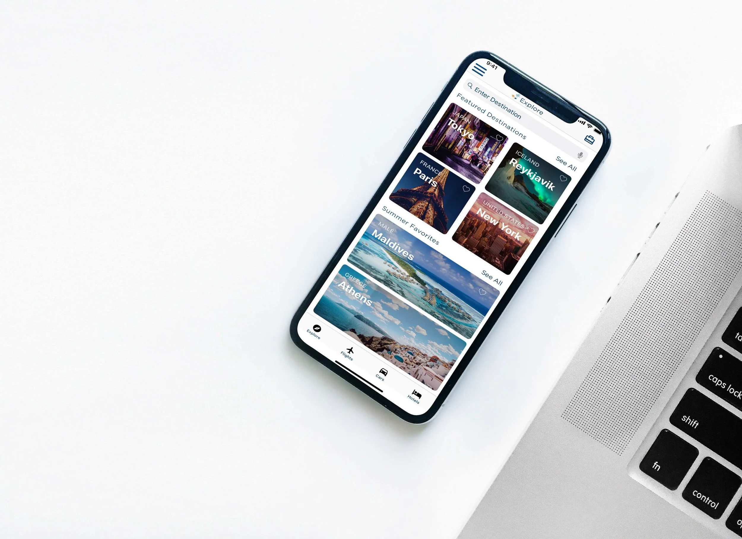
Home Screen is redesigned to allow users to search for destination while exploring popular destinations. Buttons are prominent to the user to allow users to see content and information while also having the freedom to specifically search for a destinations. The hamburger menu is places on the left to view account information and settings. The suitcase on the right are items that users have added to the suitcase for purchase. These items in the suit case can be flights, cars, or hotels that users have interest or added to their suitcase.


Flight selections are in a list format to allow users to input information in a step by step format. The vertical design pattern allows users to efficiently fill in a form and reduce human errors.
With a clearly defined banner, users know which airport they will be departing from and where they will be heading. Users can switch between round trip or one way with a click of a button. Dates can be easily edited and reselected by clicking on the calendar icon. Travelers can be added or subtracted and class can be edited.
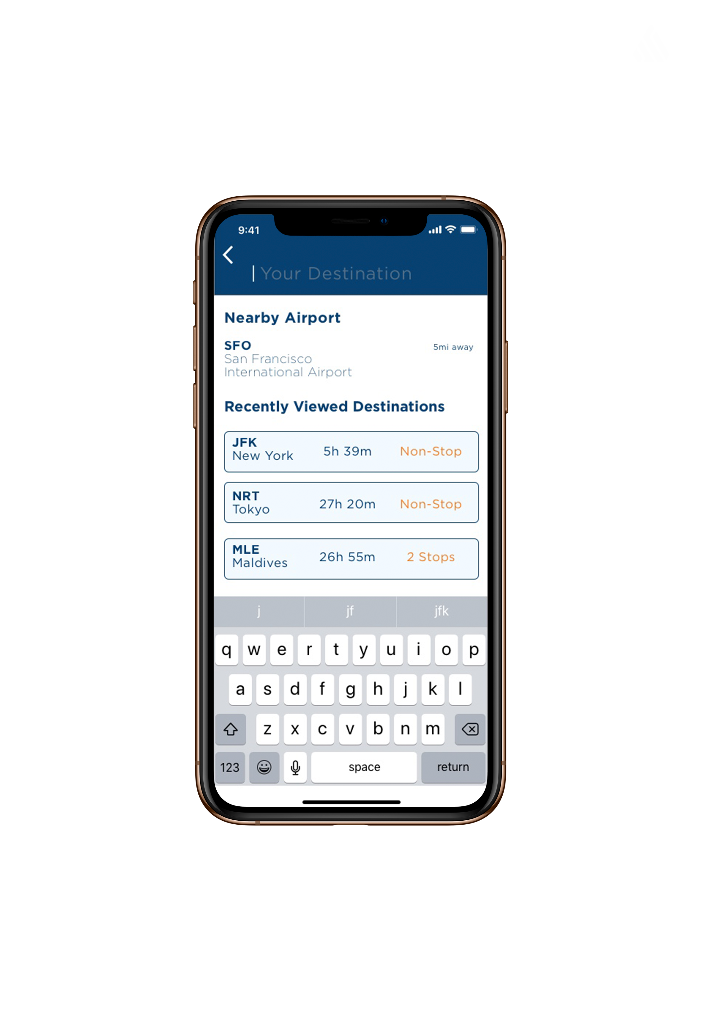
With the search feature, user can type in their desired location. With your location service on, the app will locate your nearest airport. If you have recently viewed a destinations, you can click on the destination for quick access to view time, dates, and flight information.